Polkadot
UI
Visual design
Design system
Visual refresh and design system for a blockchain network
Working as a UI designer at Stink Studios, we redesigned the website of Polkadot as part of a wider rebrand. An extensive component-based design system was created in Figma, and synchronised with developers to be built in Storybook.
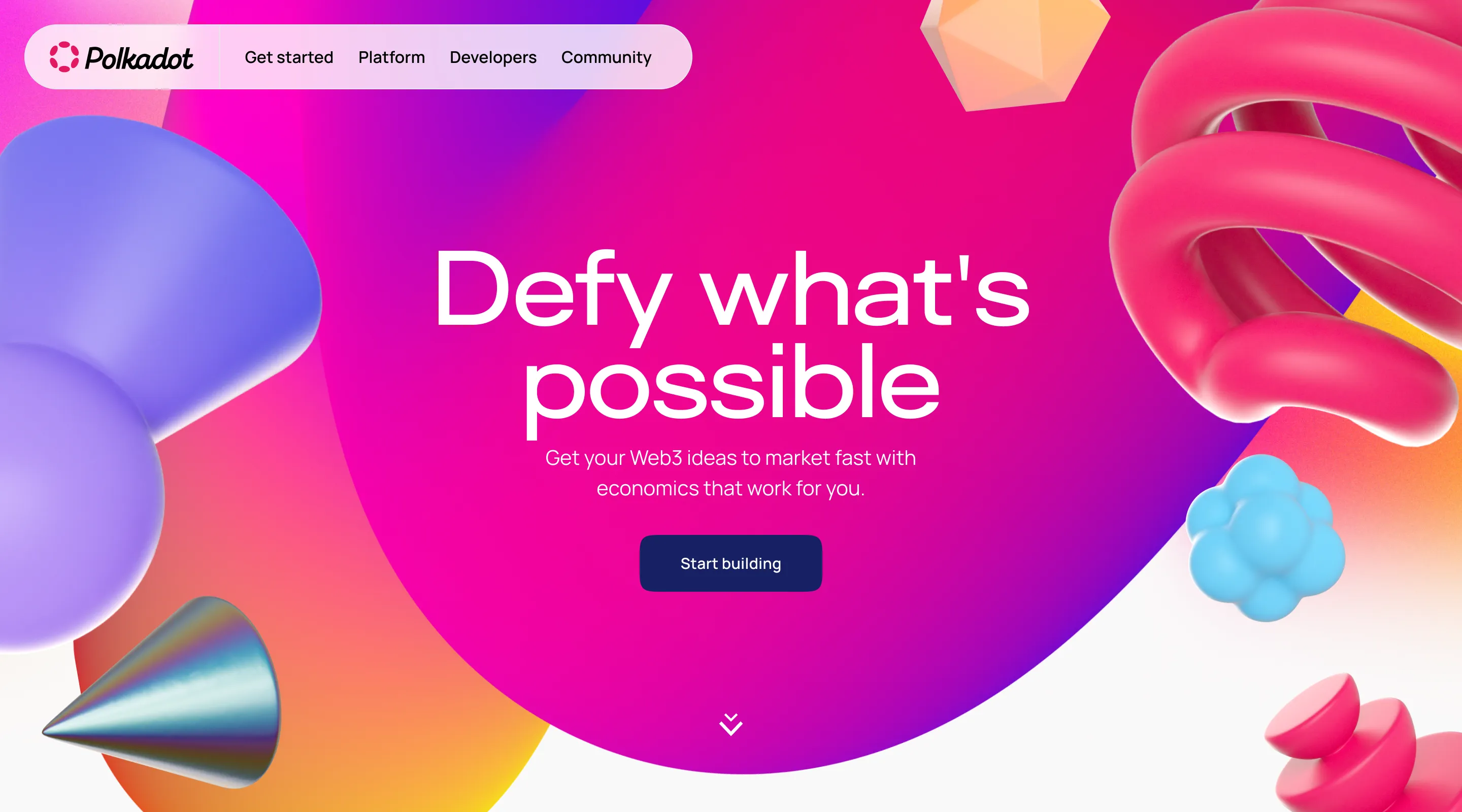
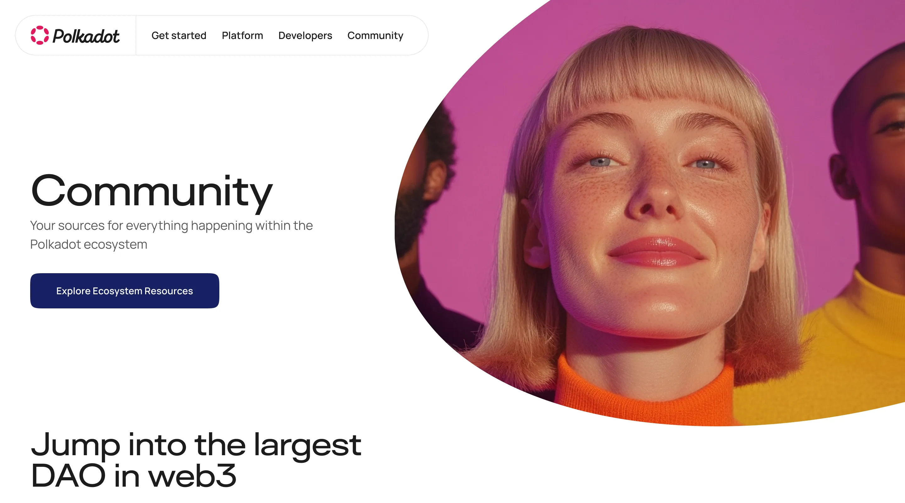
Homepage
Objectives
1
Create a flexible design system to be used in a CMS managed by non-designers.
2
Improve the navigation and signposting throughout the site
3
Craft a vibrant visual style that sets the brand apart from competitors in the blockchain space
Deliverables
Design system
Component library
Page design templates
Art direction guidance
Asset library

Homepage

Homepage

Homepage

Homepage
Design system
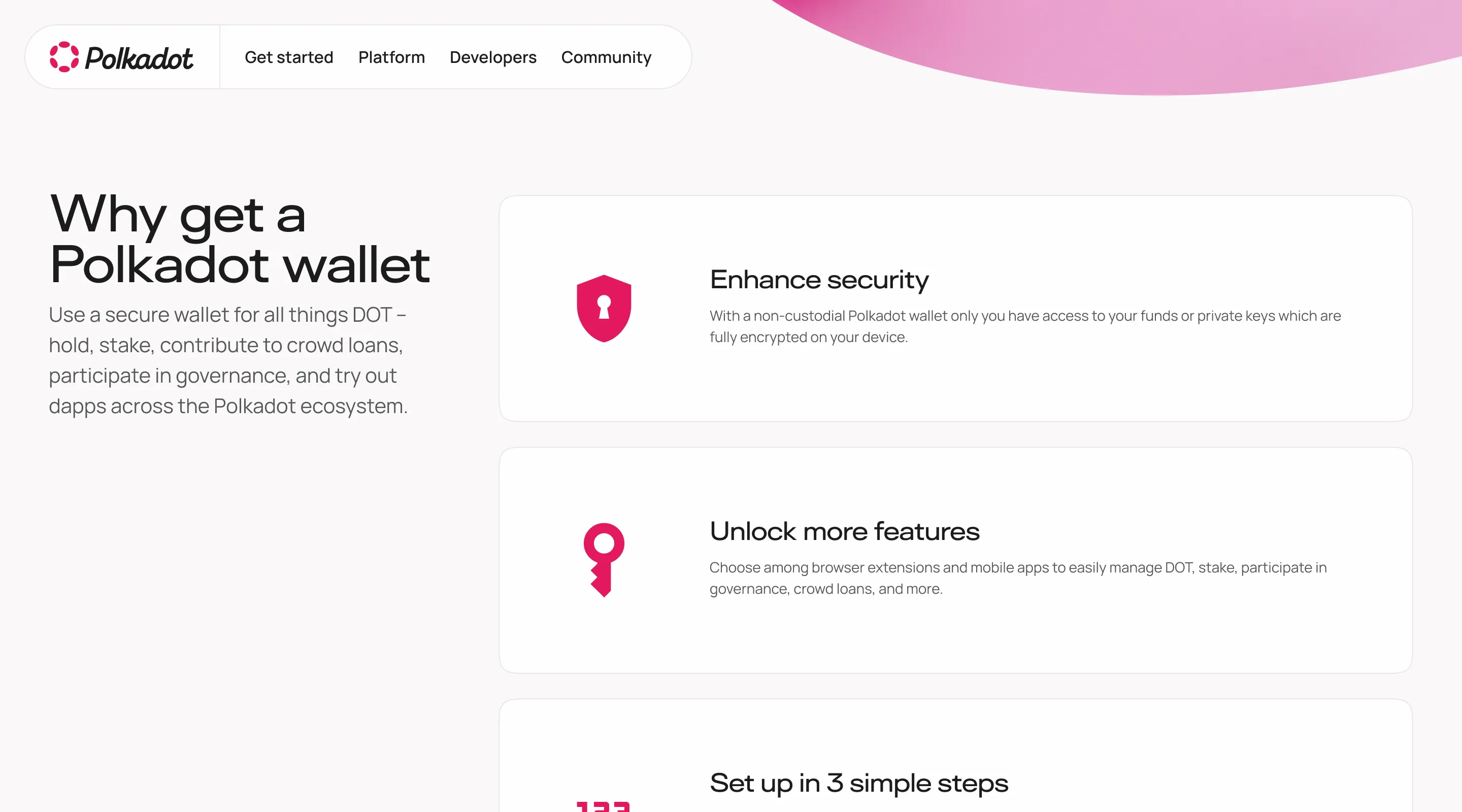
The large, content-heavy website is managed in CMS by non-designers, and so needs flexibility in all components to cater for any need. Each component was designed with many variables, which can be switched on and off in the CMS depending on the content.

Content cards
Customisable components, offering flexibility to adapt to varied content
Content card variables
Content carousel
Featured content
Atoms
Design system
Components
Navigation
Navigation
- 2-tier navigation
- Mobile - tap arrow to expand, tap hub name to navigate to page
- Desktop - hover to expand, click hub name to navigate to page
- Active page indicators on page names
- Breadcrumbs in header of every sub-page
Navigation
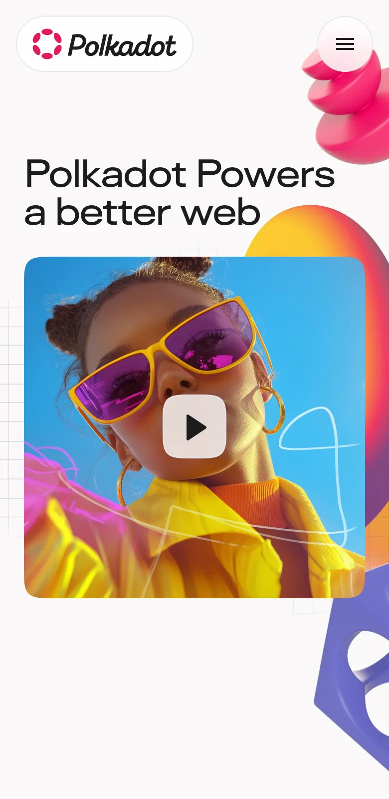
Art direction
Sample pages were created to showcase the design system in action, illustrating how 3D assets and photography can bring content to life. All photography used is AI-generated.
Hub page hero
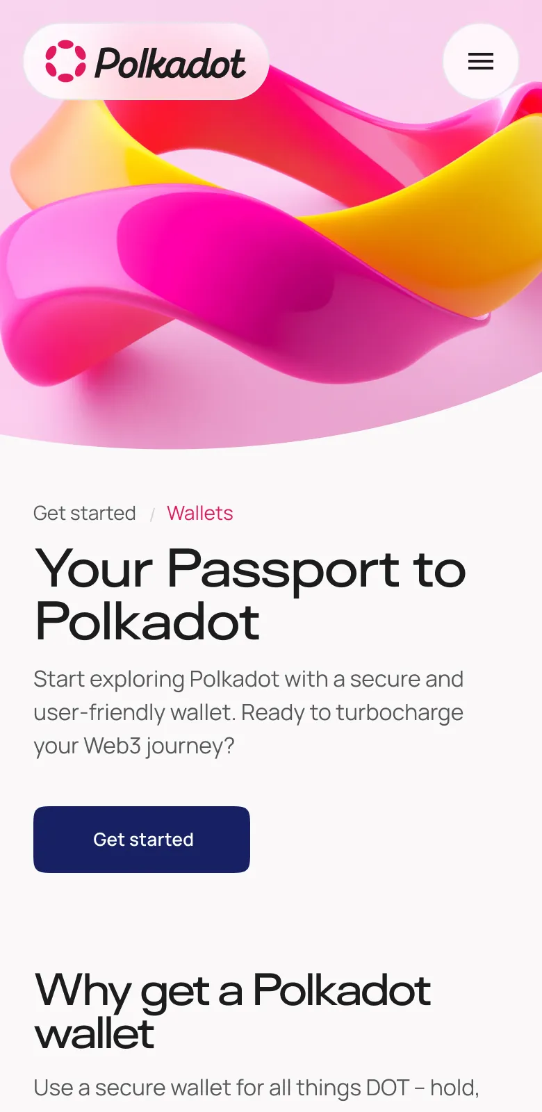
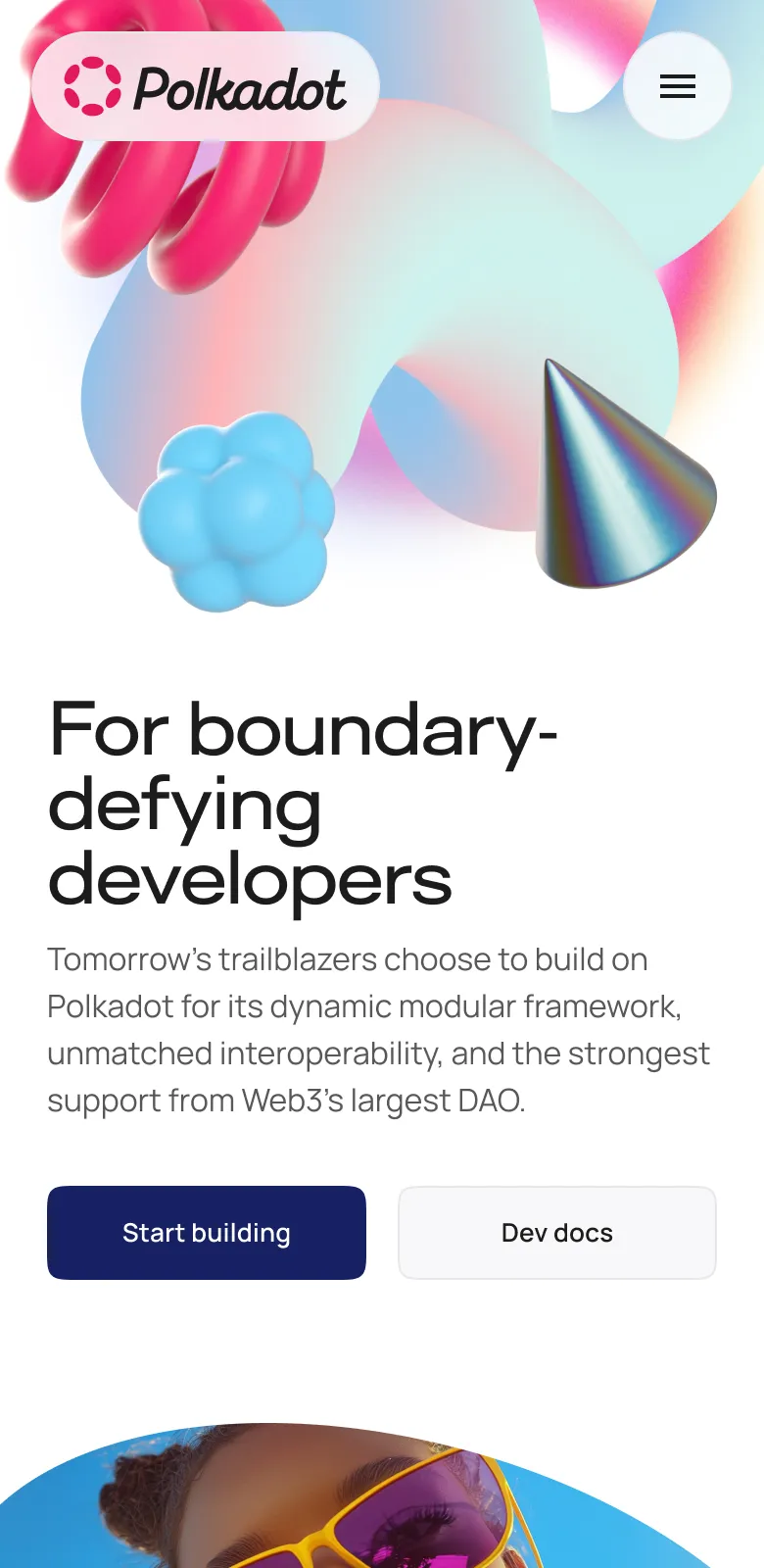
Hub page hero
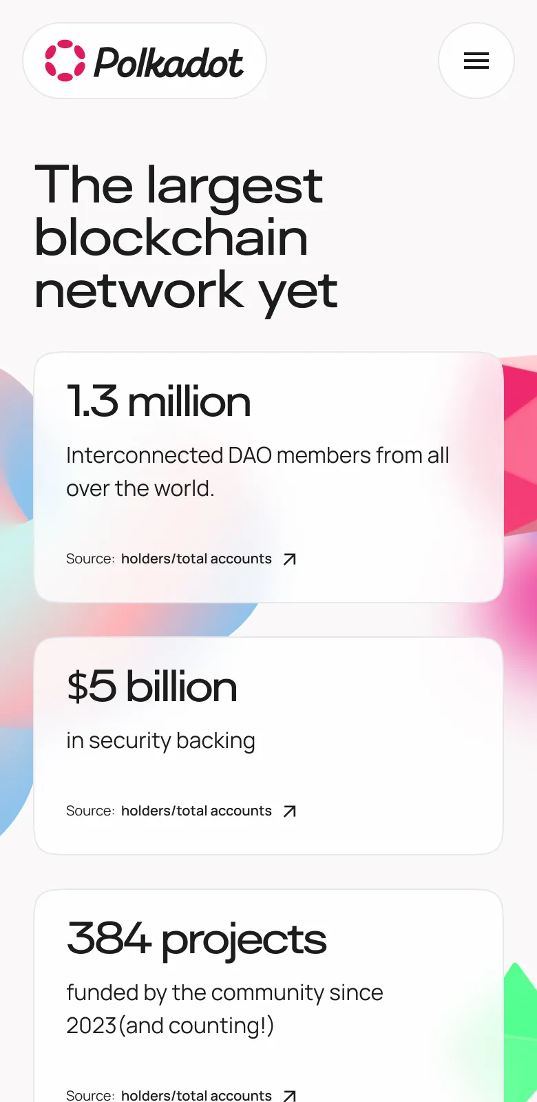
A diverse set of assets to represent the endless possibilities within the Polkadot network.
Assets

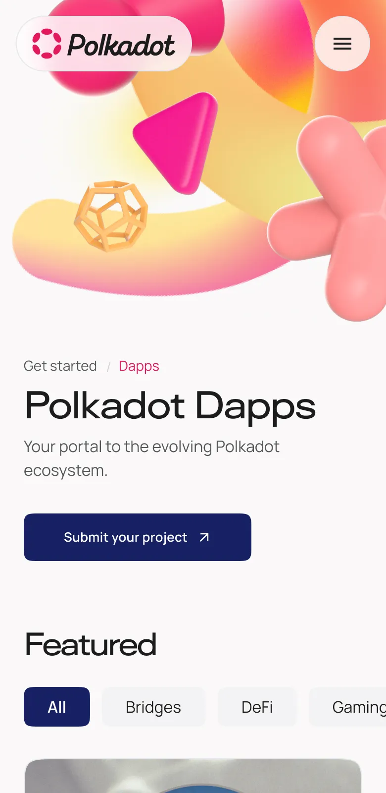
Hub pages

Content grid
Photography
Leveraging AI-generated visuals to guide the style of future assets.
Featured content

Image module
Additional credits